Spotify: Search for lyrics - concept
A personal project that came to be one day I was biking to work.
Please watch a short video preview of the full concept, and scroll for the process.
Remember sound
If you understand Danish and don’t feel like reading a lot, I did a video talk/presentation about this project that follows the same steps and format as this article.
The idea / problem
One day I was biking to work, and I had this song stuck in my head. I only had the melody and a sentence that I didn’t know if was correct.
Coming into the office I wanted to find the song, and since I use Spotify for listening to music I opened the app and wanted to search for the lyrics I thought I could remember.
To my surprise, this feature didn’t exist on Spotify… And therefore I thought:
‘’How would such a feature work?’’
Zero search on Spotify, when searching for lyrics
Process
To start things off, I wanted to create a scope for the project (most of all to limit myself, so it wouldn’t take up all my time).
So I created a How Might We question:
How might we…
Give users of Spotify the ability to search for lyrics and find the song they have stuck in their heads?
Moving on from that, I needed to do some research to know more about the problem. Especially how requested this feature was, and also what the best practice where when people wanted to search for lyrics.
Research
How requested was this feature?
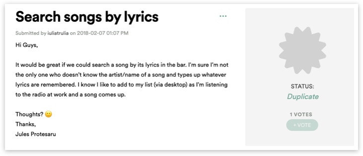
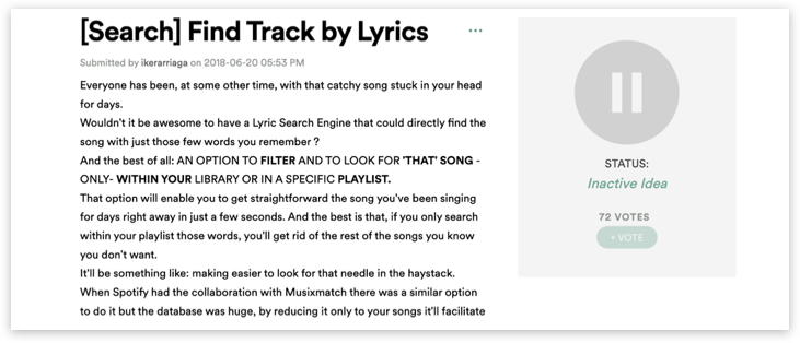
Since Spotify has an amazing forum where they collect user feedback and requests, it was quite easy for me to dig up a couple of feature requests that talked about the ability to search for lyrics.
Here are some examples:
After these findings, I knew that I wasn’t alone with this request, so it gave me further motivation to create this concept.
What is the current best practice?
To seek information about the best practice when searching for lyrics, a simple google search for ‘’search for lyrics’’ gave me a couple of sites:
https://findmusicbylyrics.com/
After trying out the different sites, my findings where:
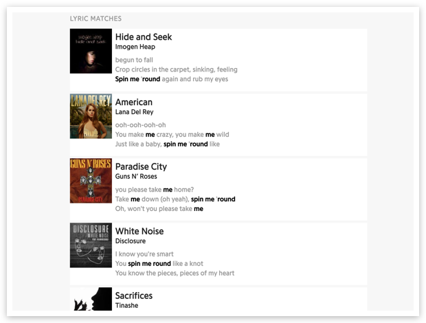
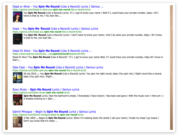
They all display information about the song, but also the artist
Clear indication about where in the song (lyrics wise) your search matches
Showing the context for the lyrics - small text snippets before and after your search-match
Here are some examples:
To conclude on my research, I wanted to add-on a few lines to my How Might We question, to future narrow the project, but also add-on some of the findings.
How might we…
Give users of Spotify the ability to search for lyrics and find the song they have stuck in their heads?By…
… making it easy to play the snippet of the song, that includes the lyrics-match.
… helping users find the correct song if they can’t remember the lyrics 100% (goes back to the original problem)
Let’s sketch!
After all the knowledge-gathering it was time to start sketching out a few ideas.
First I wanted to understand the current flow for searching for stuff (Songs, playlists, podcasts, albums, etc.)
Doing that process, I started to note some ideas for feature placement and possible promotion of the implementation.
I quickly moved on to some ideas that would solve the feature of playing the snippet of the song you’re searching for… Which let me to my first idea for the full flow.
Main idea:
Intergrade search for lyrics in the current search-feature
Show snippets of songs, and highlight matching-search lyrics
2 actions = Be able to play a full song & be able to play the snippet that matches your search
Indicate a match score so users know how well the songs match their search
Suggest changes in users’ search to increase the match score. Possibly using synonyms.
Time to wire up those frames
Do make sense of the idea, I jumped over to Sketch to increase the fidelity of this idea. And also to find out, if my idea of the interactions would work.
Most of the ideas seemed doable and would fit within the current conventions used in the app… I just had one problem.
The already established way of showing a song in Spotify’s UI.
Since this feature should feel like an add-on and not a huge change for the user, I didn’t want to change the already defined way of showing a song in the UI - and as well keep the functionality.
In my original idea, I had the idea to place the snippet-preview action on the right side of the UI card, but it would then interfere with the ellipsis action menu.
So I had to find a different solution, which you’re going to see in the final concept.
The final concept
And now to the fun part - the final concept.
You can see a full video presentation of the concept if you scroll to the top (remember sound).
But let’s dive into the small parts of the concept.
Search
By integrating this in the already known search-function, we limited the learning curve and gave the feature high discoverability from the beginning.
Screen breakdown of the search flow:
Synonym suggestion to increase match score
As one of my HMW questions, I wanted to help the user find the correct song if they can’t remember the lyrics 100%.
My solution for this was to create a synonym suggestion system that looked at synonyms for the search words and would suggest a word change if it would give a better result.
Therefore I also implemented a match score indicator that reflects how well a song, matches the search lyrics.
Previewing the matching lyrics-snippet of a song
By keeping the normal UI-card of showing a song, I added a section underneath that displays:
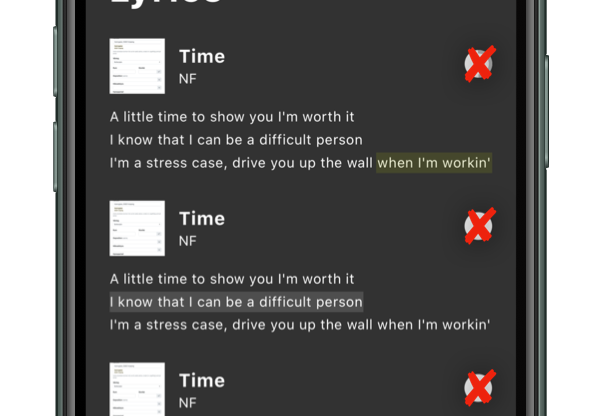
Lyrics-snippet (including the matching search text)
Match score (how well does the song match your search?)
Play-snippet action (be able to play the lyrics that matches your search)
When the snippet is being played, the text-highlighting will animate and follow the text as we know it from karaoke.
When the song hits the searched lyrics the highlighting will increase and it then makes it easier for the user to identify if this is the correct song.
Tying everything together
Combining these two sections of the prototype gives the full concept.
See the full interaction here, and please remember to turn on sound
Conclusion
Main goal of this project was to discover how a ‘’search for lyrics’’ feature would work inside one of the world’s biggest music platforms.
By using already made conventions, and well known UI-element, the final concept came out pretty subtle without introducing big new learning curves for the user.
I shared the concept on both my Instagram and Linkedin, and the feedback has been quite positive.
A couple of months after sharing, I did a video presentation for my local UX community where I talked about the process you have read about here.
I hoped you enjoyed reading about this concept, as much as I enjoyed creating it.
CHECK OUT SOME OF MY OTHER PROJECTS


