Creating and maintaining a design system at BoligPortal
Introduction
During my time at BoligPortal, I lead the product/design process of creating a design system that would lay the interactive and style foundation of a new platform we were building. A universal platform that had the scope of combining three different products.
This write-up will go through the process from scoping and finding the goal of this system, to how we kept it up to date and iterated each development sprint after introduction.
Role
Lead on the product and design part
Company
BoligPortal
Time period
2019 and ongoing
Credits
Patrik Melis - UX designer
Helping create the most badass Sketch/Figma design system
Problem
When I started working at BoligPortal I joined a 17-year-old company. A company that lived through multiple digital-product trends.
BoligPortal.dk - Year: 2002
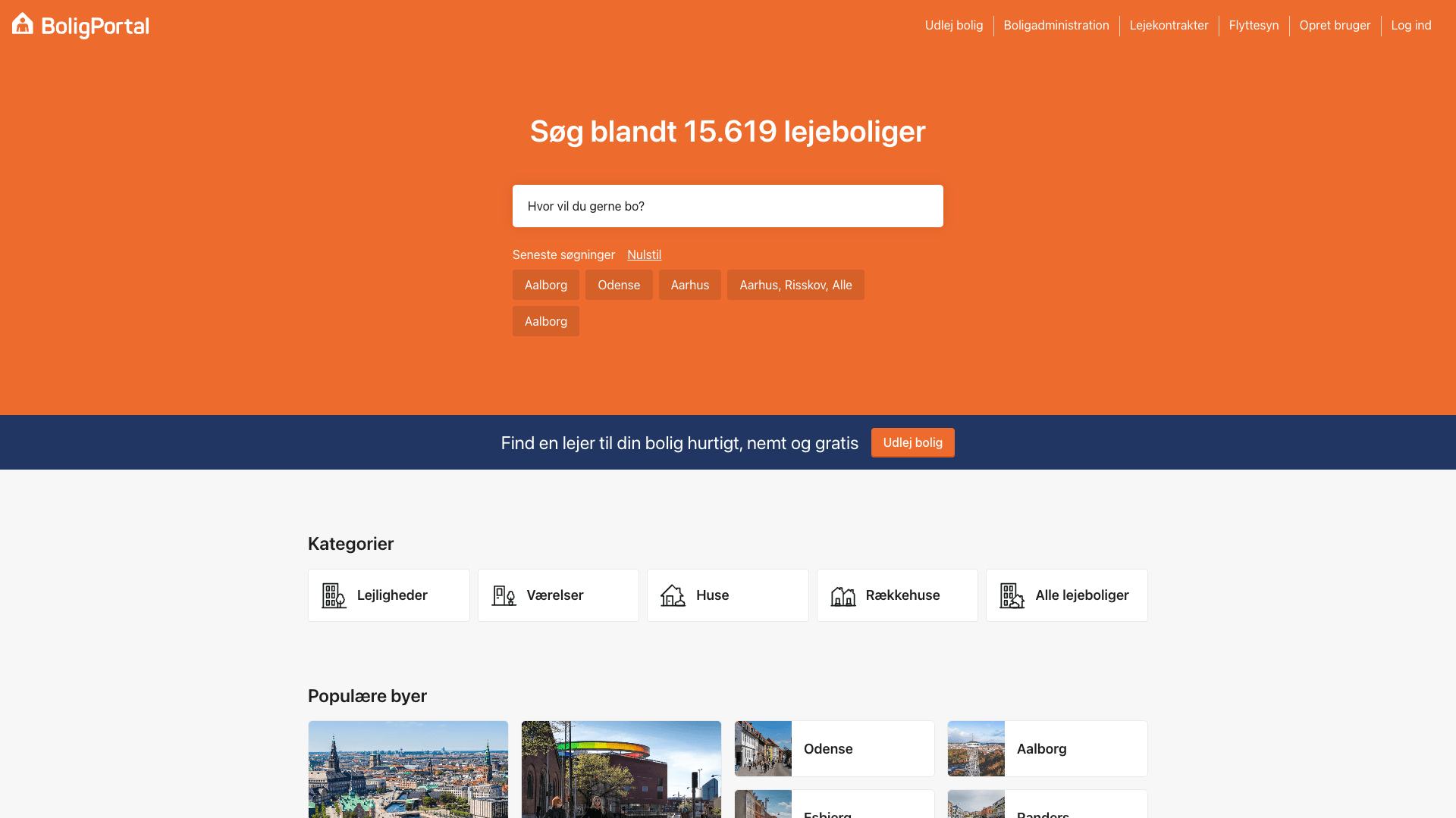
BoligPortal.dk - Year: 2022
BoligPortal started as a:
B2C: A single marketplace website where you could find your next rental home
But later introduced a widespread product portfolio targeting both landlords and property seekers, in multiple countries. Products like:
B2C: Marketplace website for finding your next rental home
B2C: Companion mobile application for the marketplace
B2B: Administration tool/backend-system for landlords and their rental advertisements
B2B: Contract builder for helping landlords create, sign, and store their rental contracts
B2B: Inspection tool for landlords to inspect their rentals when tenants move in and out
Internal: Backend admin system for employees (sales and customer service mainly)
With this swift, both in audience and complexity, the state of the products was spread out, when it came to overall design language, conventions, and interactions.
Especially on the B2B front, the three main products had majorly different designs and interaction conventions. Something that made customers think the products were made by different companies.
It also had an impact when customers had to start the transition from one product to another, because of the lag of shared conventions. Impacting negatively on our user's learning curve.
BoligPortal.dk - Landlord messaging system (Year: 2020)
Flytterapporter.dk (Year: 2021)
https://kontrakter.boligportal.dk/ (Year: 2020)
Besides the different designs, all three of our B2B products were hosted on three different platforms, with no shared information between them. That was causing major pain both internally and externally.
This was about to change.
Because of these learnings and a strategic change, we were going to make one platform, that combines all three of our products.
A shared platform where landlords could advertise, make contracts, and do inspections using the same fundamental data structure.
This meant we had to rethink all of our interactions, styling, conventions, and make one design system that could handle this new platform, and pave the way for our future products and features.
We also knew our team was about to grow (we eventually doubled the size of our product team). So this new design system was also going to be a tool for us to keep consistency in our features, and to decrease the amount of decision-making in each project.
Kick-off
The state of the company and our team at this time were chaotic, but in a good way.
Our goal was trying to figure out how all these products would work together, migrating an (very) old platform, and handling team changes. We knew it would be over the top if we aimed for a state-of-the-art design system including all the components you could think of.
So instead of spending months trying to figure out the future, we decided to let the future dictate which components we made, and in which order.
We therefore started by doing some concept designs, to establish a component fundament, and then introduce new components as they were needed.
Design concepts (Year: 2018-2019)
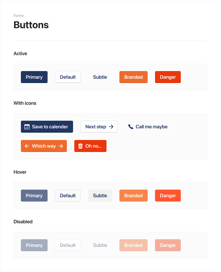
After the concept design, we had an overall look-and-feel and had the fundamentals in place: Buttons, forms, colors, type, icons, etc.
With this setup and a technical foundation following the atomic design methodology, we had version-1 of our design system, that we could use for our first features and get feedback from customers. This system focused on iterations and ensuring changes wouldn’t be a headache.
Our focus
The system should account for the high daily enterprise usage by landlords, primarily on desktop, but should also be great for property seekers surfing our marketplace on their phones.
Website screenshots of BoligPortal.dk (Year: Early 2022)
While we aimed for one system used by two different kinds of user segments, we had a couple of things to consider.
For example…
Make small efficient components like our check fields, and make them reachable, discoverable, and usable on mobile.
Having accessible touch targets.
Hierarchy in our actions helps us communicate importance from feature to feature, and from screen to screen.
Focus on making inputs discoverable, by having accessible contrast on whichever background they’re used on. This was based on feedback from our previous products.
We often have information where it’s important to get the users attention (or at least try to).
We worked on a new component with the focus to stand out on a screen, to communicate something important.
For example where we want to give subtle information about a feature, in this case our tooltip.
The never-ending story
We knew from the beginning that we weren’t gonna have the full toolbox from day one. As mentioned, our strategy was to introduce components as a new feature was added to our platform.
The system will never be done and is evolving every day. Tweaking the small details, and adding new components as our product-needs increase.
As pr. 2022 the system is being used by 4 individuals (Product manager and designers) working in our shared Figma Library, collaborating with +5 frontend developers responsible for the code.
Example for a design project in Figma (Year: Early 2022)
Before continuing to my learnings for this process, I want to showcase some of the components and their usage.
Normal dialog - Used with a free layout area for explaining complex actions. Focus on clear action hierarchy in the action footer, with strict usage of primary and secondary actions.
Dashboard cards - here used for showing landlord their current tenant in their rental
Data tables - used everywhere is our products. Ready to contain a lot of information and actions
Icons + tooltips - In condensed UI we try to optimize space and still make an effective product. We then sometimes have to rely on our established icon-set, and then follow our rule to use our tooltips to communicate the actions.
Progress stepper - When users have to fill in long and complex forms to accomplish a job, we use these to guide them from section to section, keep an overview of how far they’re, and show if something is missing.
Tabs, breadcrumbs, and notice - here is an example of multiple components being used on a complex screen.
Goals here is to give the user an understanding of where they are in the system, as well as being able to drill down into information (here using the tabs and breadcrumbs). But there is something important to tell the user, and that’s where the information-notice comes into play.
Empty box - Generally used for adding content. Here is used for adding a picture and showing the user where it will be placed.
Slideover - pretty much a dialog that comes in from the side. Used in cases where we really have to show a lot of information and actions. Turns into a fullscreen dialog on phones.
Learnings
This was my first time creating such an extensive system, where the development spans across multiple years and the ‘’final’’ result is being used by thousands of people, I learned a lot.
The processes and ideas that were reinforced
Adding components on the go
With our focus to create the bare minimum in the beginning, and adding components as they were needed in each project, turned out to work perfectly and decreased a lot of headaches in the beginning.
Importance of a good (open source) icon library
Knowing from the beginning that our UI would depend quite heavily on icons and pictograms, we decided to invest time into choosing a versatile icon library. Also knowing our company size and resources, we knew to choose an existing and open source library.
We ended up going with Ionicons.
Things I would have done differently
Thinking about size
I wished we would have talked and thought about the sizing variants of our components - especially buttons. Working with complex enterprise software, we oftentimes run out of space, and where every small pixel counts.
Kickoff process
As mentioned we decided to kick off the system by creating the most essential components and then work from there.
During that process, we learned how important it was to keep a steady feedback loop from the development team to the product team. Something we could have done a lot better.
CHECK OUT SOME OF MY OTHER PROJECTS


