Designing, prototyping and user testing a chatbot for user onboarding
Design
Introduction
This case study contains an insight on how I designed, prototyped and user tested my concept of a chatbot in an onboarding flow for a roommate-finding app.
Why use a chatbot for onboarding?
This concept was a part of my bachelor's degree project, so the decision to use a chatbot was taken after doing a lot of research on the concept, the roomie culture, the rental market, etc. This case study will only include the design work behind the development for the chatbot, and not the project scope itself.
To sum up the goals of this chatbot:
To help users fill out the right information on their profiles, so they include the right data points when other users visit their profile.
To use as a communication tool to inform the users of the importance of finding the right roommate.
The design of a chatbot
Creating the structure before making it pretty
Before heading into the pixel design of this chatbot, it was important to understand the complexity behind the whole user flow.
To create this understanding and overview, I created a flowchart that communicated the different ways users could go within the conversation.
Creating this flowchart gave me the opportunity to think about the small details, interaction patterns and small flows inside the big user journey.
Flowchart of chatbot conversation
Friendly chatbot character design 🤖
There was a small concern regarding using a chatbot on this segment of users in the context of onboarding.
I was reaching out to a pretty young user segment (18– 23-year-olds) with an above-average technology understanding (students), so it wasn’t the technical part I was concerned about. I was more concerned about if the user understood that they were talking with a robot and not a real human being.
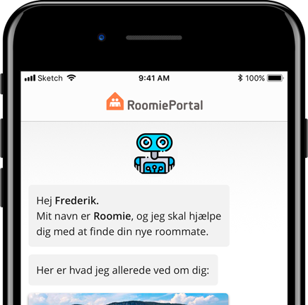
I, therefore, decided to create this robot character called Roomie 🤖 — that would act as a guiding hand all the way through the onboarding, but also afterward inside the app interface.
My hypothesis was that this character would inform the user, that they were talking with a ‘’robot’’ and not a human.
This hypothesis was also a part of the user testing, which we will talk about later.
Roomie the chatbot 🤖
Reachability for user controls
Since I choose to use the chatbot in the context of user onboarding, the user won’t be the only one inputting information in the onboarding flow.
Roomie (The Chatbot) will also be communicating from time to time, and give feedback based on the data inputted from the user.
It was therefore extremely important to create an optimal signifier, that told the user when they should input data, and when they should just sit back and receive information.
I decided to put the user control panel at the bottom of the screen, for optimal reachability. While showing and hiding the user controls depending on which state the conversation was in.
Receiving information = controls hiding and more space for the conversation
Giving information = controls shown, and easy to reach
Different conversation states
Prototyping the chatbot
After the design phase, I needed to create a prototype that could give the right user feedback and insights doing the user testing.
I decided to create a high-fidelity prototype with advanced animations to create the most realistic user test.
The animation was quite important for the user to understand the context of the conversation, the motion of the user controls, and user input.
After designing the screens in Sketch, I moved the whole thing to Principle and started creating.
User controls
The important thing to remember when creating the interaction for these user controls was using the animation as a signifier, so every time a set of user controls pops up from the bottom, the user knows it’s time to take action.
The feedback here goes two ways.
When the user selects an option, I wanted to give feedback that we’re sending your input and you no longer have to take action.
Warning… Nerdy stuff. Fell free to skip 😇
Calculation of animations based on their position
In the process of creating this prototype it quickly occurred to me, that timing and animation length was quite important to create the optimal user experience.
I figured out, that there would be some cases where the system/chatbot would give 3–5 messages in a row, which could end up in an information overload for the user.
So to help users read and understand the messages, I created an equation that calculated the amount of time a message should be number one in the conversation, to create the optimal reading experience.
This equation was based on the average reading speed for our primary segment.
Average reading speed for students = 300 words pr. Minute. (Rankin, 1993)
I thereafter ran every message through a readability calculator from edgestudio, which gave me the option to set the reading speed (in this case 300 words pr. minute) to then get an estimated time, on how long it would take a user to read it.
We’re thereafter adding 50 milliseconds pr. Messages in a row, with no user input.
Example: If a message is the third message in a row from the chatbot/system, we’re adding 50x3 milliseconds to the amount of time that message should be number one in the conversation.
This is based on research by the National Institutes of Health, where they gave an estimate of how long a picture, message, or information should be in the primary focus before a human would be ready to process the information. (Trafton, 2014)
A message being number one in the conversation
All of this ends up with an equation that looks like this:
Time calculated with the edgestudio calculator + Position of message * 50 milliseconds
Example:
Message text: Bare for at være sikker, så sørger du: Bolig i Aarhus, med en roommate som gerne må være en mand, mellem 20-28 år.
Position = 2
Calculation: 5000 (Edgestudio)+ 50 * 2 (Position)= 5100 milliseconds
Converted to seconds = 5,1 seconds
User testing
Before starting the user testing phase, it was important to first establish a testing segment, and thereafter a set of testing goals.
Finding the testing segment
In the specific case, the testing segment is pretty self-explanatory, since the whole concept is based around a set of pre-done work regarding what kind of people are sharing rental homes in Denmark.
As referred to a couple of time, the primary segment for the concept and therefore the test would be:
Students, male or female, in the age 18–23 years of age.
Creating the test goals
The primary focus of the test would be to test the onboarding flow as a concept, information gathering, etc.
But since this article is mainly focused on the UX and design part of building this chatbot, I’ll keep focusing on how I tested the UX and usability of the prototype.
To make sure that the user experience is optimal for our segment, I wanted to test:
Do users understand the context of talking with a robot and not a real human being?
Do users understand when and how to create user input?
The primary reasons behind these goals were to ensure an understandable experience for the users, where the robot-part would be fairly easy to understand and therefore not misinterpret, and easy for the user to create the right user inputs in all contexts.
Roomie (The chatbot)
Testing scenario
The goal of creating this testing structure was to tell a story.
A story that would put the user in the right context, and give him/her the right amount of information to complete the test.
Since a part of the test would be testing the different user-input interactions, and see if they were intuitive for the user to handle and use, the testing person was given this story with a set of datapoint that they would afterward use when the chatbot was asking for their interaction.
A testing scenario could go something like this:
‘‘You’re Frederik, and you want to find wants to find a roomie. You’re interested in finding a male roomie between 23–30 years of age, in the Aarhus area. You’re seeing yourself as a very helpful person, and think that common interests are important when finding your next roommate. You are interested in things like sport, politic, and boats.’’
Testing the test… Pilot test 🛫
Before heading into a user test with 6 people, I wanted to make sure that this testing structure would be optimal and easy for the testing persons.
Findings of the pilot test:
The huge amount of information given to the user at the beginning of the test would be extremely hard for them to remember, and at last, the testing person would forget what they were being told 5–6 minutes ago.
Solution:
Still telling the story and user scenario before starting the test, but keep reminding the user of the data points so it stays fresh in their head and it’s, therefore, easier for them to concentrate on the interactions.
The testing round
After establishing the testing goals, scenario, and pilot test — it was time to do the testing round and handing out the prototype to real users.
This testing round included 6 testing person from the correct user segment.
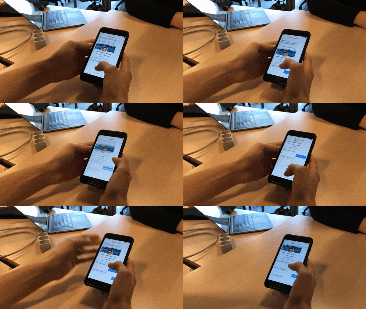
The testing person where given a phone with the prototype preloaded, and could now begin experiencing the onboarding flow.
User testing the prototype
Findings and iteration
There was an overall positive feedback of the experience itself. All user understood the context of talking with a robot and felt like they got an understanding of the concept, halfway through the flow.
Nobody experienced the flow as being too long or complicated, but there where a small number of hiccups in the usability…
Findings
‘’How you I go forward from here?’’
This was a sentence that almost all users were saying when they reached a certain step in the flow.
For the majority of the interactions, I chose a simple and easy way of selecting and sending information to the conversation.
The user is presented with a question.
The UI changes, and shows the different choices a user can make and send as an answer.
The user selects an option, and (on click) the system sends the information to the conversation.
Interaction pattern for selecting
Pretty simple.
But there was a specific step where I wanted the user to select a personality-type, and that required a lot of explanation text. To simplify the interface, I made a thumbnail of each personality that extended out when clicked.
Pre-test interaction
This confused people, a lot. After selection a certain personality, none of the users knew how to send it to the conversation, which ended in a confusing question:
‘’How you I go forward from here?’’
Confused user
If you look closely you can see the testing-person trying to press to UI-card twice in hope to send the information, and nothing happens.
Solution
Since this problem occurred on the only interaction pattern that was different from the others, It was a no-brainer to try implementing the interaction pattern that was being used in the other parts of the conversation.
This actually turned out to work as predicted, and the interaction didn’t cause any problems in the future tests.
New interaction
Ending notes
I hoped you liked this quick run-through of my chatbot onboarding concept. The main takeaway from this project was the importance of user testing.
You’re able to use user testing in many stages of your project, in the beginning, to get a feeling if your concept is hitting the right user jobs, or in the end to get the UX and design interaction on point.
CHECK OUT SOME OF MY OTHER PROJECTS


