Ensure access to health information
By making health care information easier to access, we can help people stay calm and informed throughout their treatment, and make sure they actually receive and understand what is being asked of them.
Company
Visikon - Mit Forløb
My role
Research, scope and design
Time period
2022
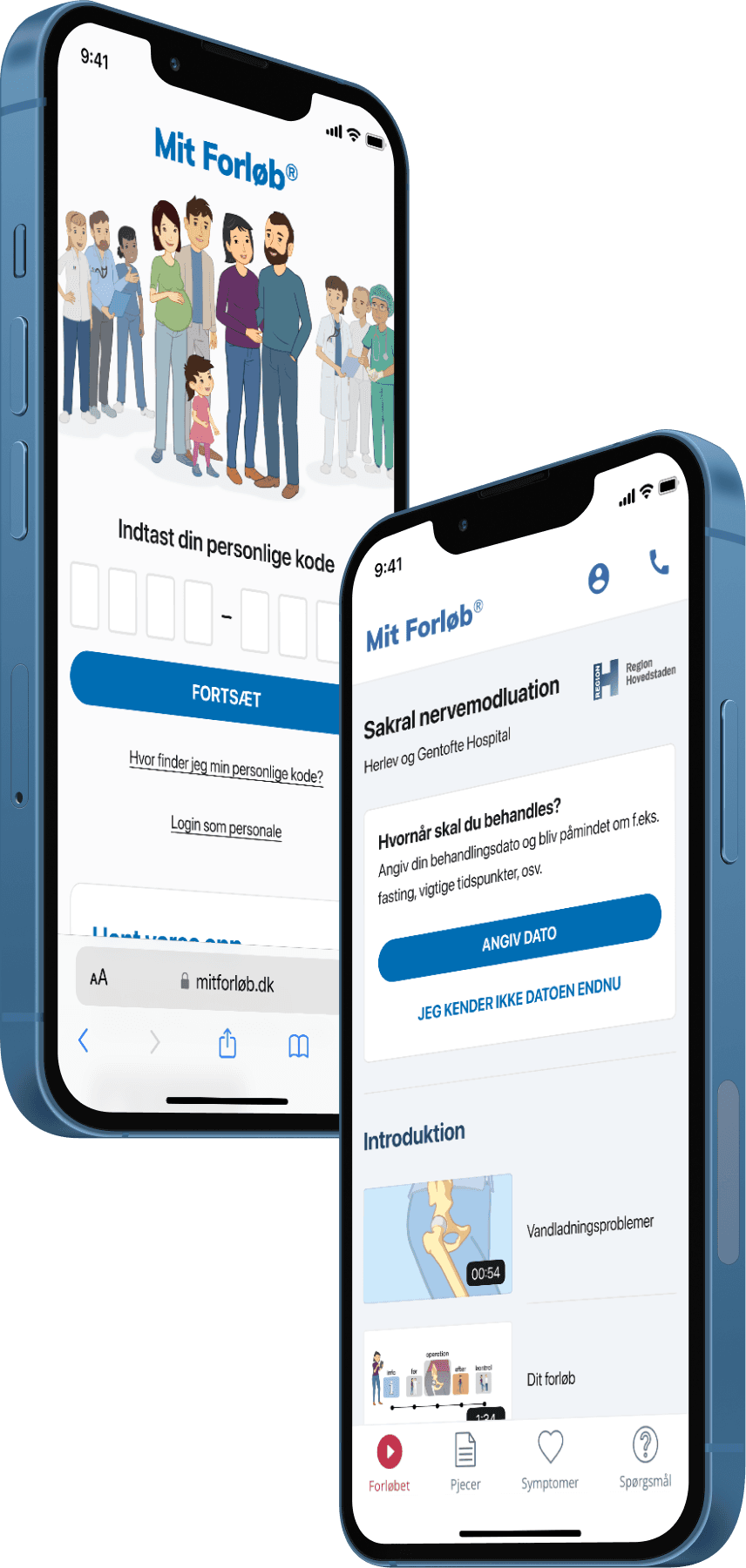
During my time at Visikon, the company behind the Mit Forløb app, we focused on an area we called accessibility: ensuring that as many people as possible could reach the materials and courses provided by the hospital.
In this write-up I will walk through how we identified where to focus, built the test cases, researched the current solution in the field, and documented the user tests. At the end, I will share a few small tips for documenting in-person mobile usability testing.
Ensure that as many people as possible access the materials and courses provided by the hospital
There were two ways a patient could get to the material.
Digital
A link was sent through e-Boks/Digital Post, Denmark's official government communication platform. Clicking it opened the material either on the website or in the app, depending on the device, whether the app was installed, and a few other factors.
Patients could also enter a code on the website or in the app. This option was mainly used when they received the link on one device but wanted to open the material on another.
Physical
A printed sheet with the same code, along with a short guide explaining how to enter it.

In both cases, customers told us their patients found it hard to understand how to get to the materials. The instructions they received were not clear enough.
As a result, patients often never opened the materials at all. They missed the preparation they needed, and never saw critical instructions about the procedure or examination, such as fasting the day before or arriving 30 minutes early.
What looked like a small usability problem had consequences all the way down the line, for our customers and for their patients.
I began researching and interviewing to understand where the usability issues came from. I spoke with former patients about how they had experienced the process. I also tested the current solution with people who had never used Mit Forløb before.
I created a test guide outlining the tasks each participant had to complete. We used the same guide to test the proposed solutions, which let us benchmark them against each other.


This gave me a clear picture of what people thought and did after receiving the printout or the link, from the first moment to actually reading the material.
The main insights were:
Too many steps
Overwhelmed with information
No contact information for when they needed help
Code input had no clear error messages, and poor usability overall
Alongside these insights, we had a business goal of encouraging people to open the material on their phones rather than on tablets or computers. That let us send notifications about the things that are easy to forget, such as when to start fasting.
Time to iterate
Focusing on these insights, I began designing and testing multiple iterations of the solution. First I addressed "too many steps" and "overwhelmed with information."
We worked on communicating the guide as concisely as possible without removing anything essential. A step-by-step bullet layout worked well, because it let users focus on one step at a time.
I also considered whether we could remove some steps altogether.
The timing helped here. The project ran in 2022 and 2023, just after the COVID-19 pandemic had made QR codes familiar to almost everyone. So we added a QR code as an entry option, which reduced the entire process to a single step.
By scanning the code, users gained instant access because the QR code included their personal code as a URL parameter. This meant they only needed to complete one step to gain access.
But QR codes were not an option for everyone. We ran the service in countries outside Denmark where adoption was lower, and they were harder to use for people with older devices or limited technical confidence.
We landed on a solution that let people choose between scanning a QR code and entering their personal code manually.

Beyond the access material itself, we added contact information and redesigned the code input, so that users got a clear explanation when they entered an incorrect code, too few digits, or made another input error.
Throughout the iterations, we kept testing and interviewing until the feedback was consistently positive.
A few weeks after release, customers reported a decline in the number of patients who either never accessed the material or struggled to get to it.
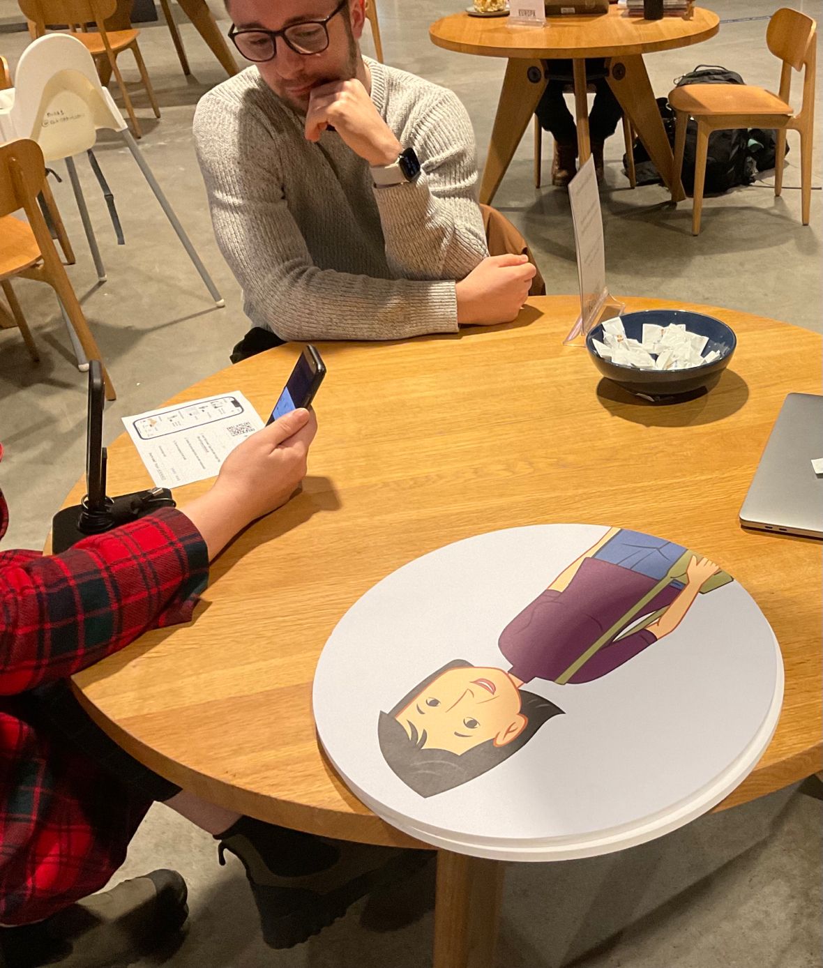
As promised, here are a few tips for recording in-person user tests where participants use their own phones:
Use a short phone stand to position the recording phone.
Use the recording phone's wide-angle lens.
Rely on the recording phone's own microphone to capture what the participant says.
