Battling navigation problems
Being able to find the information you need when dealing with a health issue is extremely important. Mit Forløb gives patients access to information about their health conditions and procedures at their own pace. They can return to read, watch, or listen to the material whenever they are unsure about something. For that to work, navigating the material has to feel natural. But customers such as hospitals and clinics told us they often received calls from people asking questions the material had already answered. When asked why they had not found the answers themselves, callers said they had tried but could not locate the information they needed.
Company
Visikon - Mit Forløb
My role
Research, scope and design
Time period
2022

The consequences when patients can't find what they're looking for
This created problems for everyone involved. Patients spent time searching, got frustrated when they came up empty, and then had to call the hospital. Hospital departments, our customers, spent time answering those questions instead of focusing on more urgent work.
So we made it a key focus: improving navigation so that moving through the content felt as natural as possible. That saved time and reduced frustration on both sides.
As a business, Visikon was also working toward a partnership with one of the hospitals' official patient platforms, which meant thinking about how to embed our product inside those platforms. The redesigned navigation had to work both natively and within someone else's app.
That is where we hit a conflict with the existing solution. Both Mit Forløb and the official platform used a bottom navigation bar as their primary navigation, which created a confusing and conflicting interaction pattern.

Designing and testing two versions
Looking at the information space and architecture, we identified two distinct content groups:
Videos explaining different stages of the patient journey: before, during, and after treatment.
Written content, including Q&As, symptom guides, documents, and more.
The main benefit of Mit Forløb is its straightforward, illustrated videos. They explain complex and sensitive subjects to patients and other non-healthcare professionals in clear, accessible language.
Research had shown the company that this content significantly improved patients' understanding of their treatment journey. It also increased compliance by helping patients remember fasting rules and other requirements. Making the videos the platform's primary focus was therefore essential.
But the written content competed for attention too. Hospitals rely on it to help patients judge whether a symptom is serious enough to call about, or whether it is normal and when to expect it.
We wanted a solution that put the videos in front of patients while still making it obvious where to find all the written material, and one that steered away from the bottom-nav pattern because of the upcoming partnership.
After multiple sessions of wireframes and sketches, we landed on two main ideas worth testing. I designed and prototyped both so we could put them in front of users.
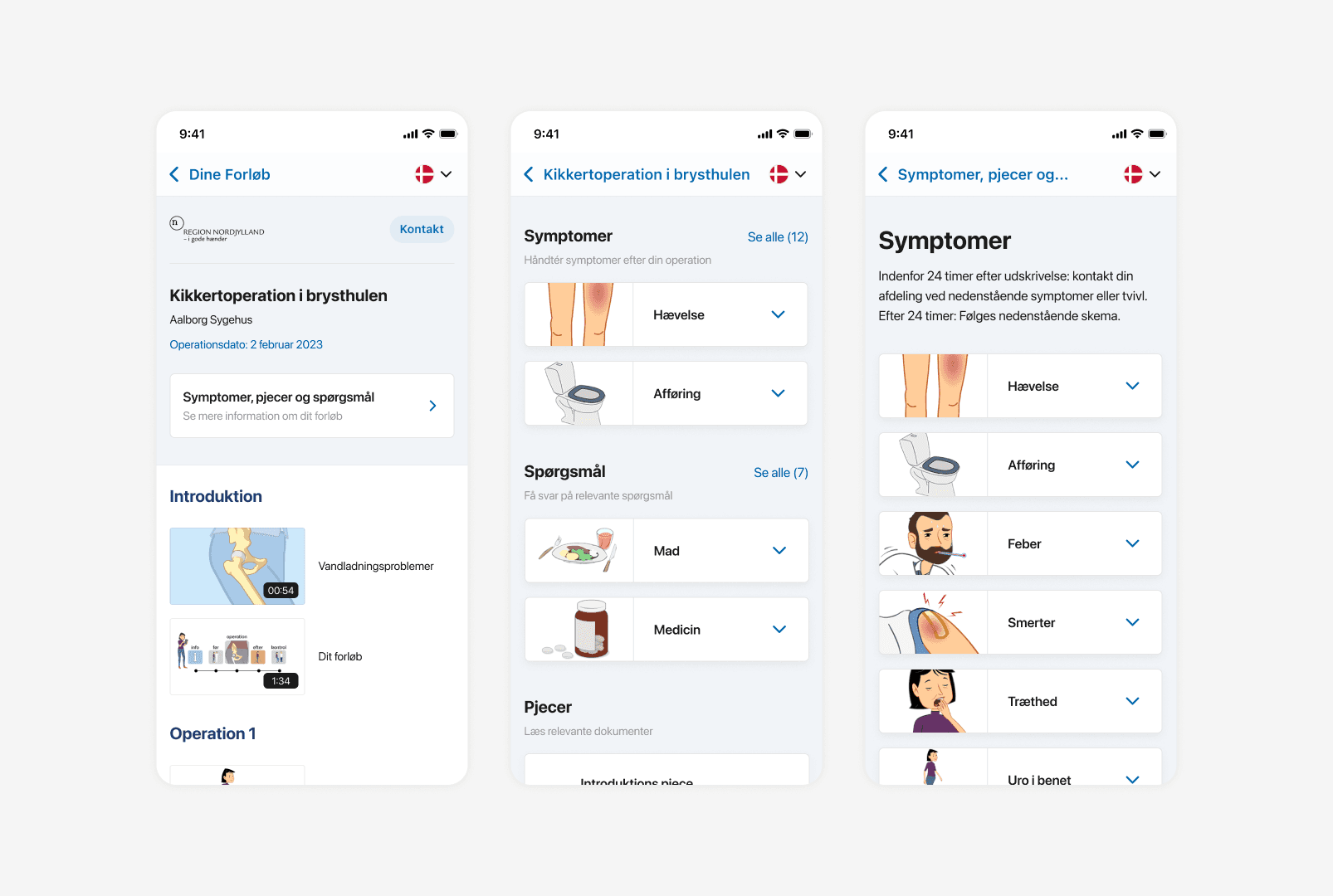

Both versions featured videos on the main page, but they offered two different ways to reach the written material. In one version, users clicked a card that led to a page containing all the written material, divided into content groups such as symptoms, Q&A, documents, and training/rehabilitation.
The other version displayed the content types directly on the main page. Clicking a content type led to a dedicated page for that category.
The testing process
Since anyone can become a patient at some point, we did not focus on a specific segment or target audience. Instead, we tested both prototypes using two user tasks:
You have undergone thoracoscopic surgery and are now experiencing a high fever of 39 °C. The department has told you that the Mit Forløb app contains information about how to handle situations like this.
This course includes a video explaining the follow-up process after surgery. Find the video and start playback.
For both tasks we deliberately started users away from the main page with the videos. That let us see whether they could navigate back to it, and whether the video sections were intuitive.
We ran both in-person and remote testing, synchronous and asynchronous. The feedback below comes from the asynchronous remote tests, and it matched what we saw in the in-person and synchronous sessions.

Here you can also see a LinkedIn post we made, asking people to try the test and tell us how it went.
The result and final version
Testing version one showed that the page holding all the written material was hard to navigate and understand, because it contained an overwhelming mix of content types. Some participants never found the material they needed for task 1.
Feedback on version two indicated that it took a little longer to understand which material types were available, but every participant found what they needed. In both versions, everyone who completed the first task also completed the second, finding their way back to the video they needed to watch. This was not surprising, as both versions used standard header navigation for the back action.
After more than 15 tests of each version, we concluded that version two was the stronger option. Following a final round of styling tweaks, we moved it into development.
We also landed where we needed to on the navigation itself. The final design dropped the bottom bar entirely, which cleared the conflict with the partner platform and left the door open for embedding the product elsewhere later.
Ideally, we would have asked our customers, the hospitals, to systematically measure how many calls they received from patients. That was not possible in this field.
Instead we had to wait a few months to hear whether they felt the update had done what it was meant to do: reduce the number of unnecessary contacts from patients. Several customers reported back and confirmed that it had.